Industry
Workers, ports, ships, factories, and logistics hubs
Capture the people, scale, and systems that move products around the world.
This page provides the essential assets and guidelines needed to represent Altana with clarity and consistency. Download our logo, fonts, and brand elements, and reference our color, and imagery standards.
01 — Logo & Usage
The symbol and wordmark use negative space and Gestalt principles, inviting the eye to fill in gaps and connect shapes. Together they represent Altana’s ability to reveal hidden insights and bring clarity to complex networks.
The full logo (symbol + wordmark) is the default and preferred lockup. Use it across most channels.
Use the wordmark alone only when the brand is already established or space is strictly limited. Reserve the symbol for app icons, favicons, and avatars where the full logo would be illegible.
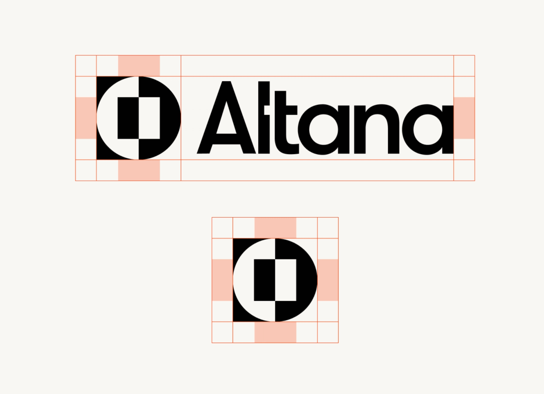
Maintain clear space around the logo for visibility. The minimum clear space equals the width of the inner rectangle in the symbol, applied evenly on all sides.
Six things never to do with the Altana logo.
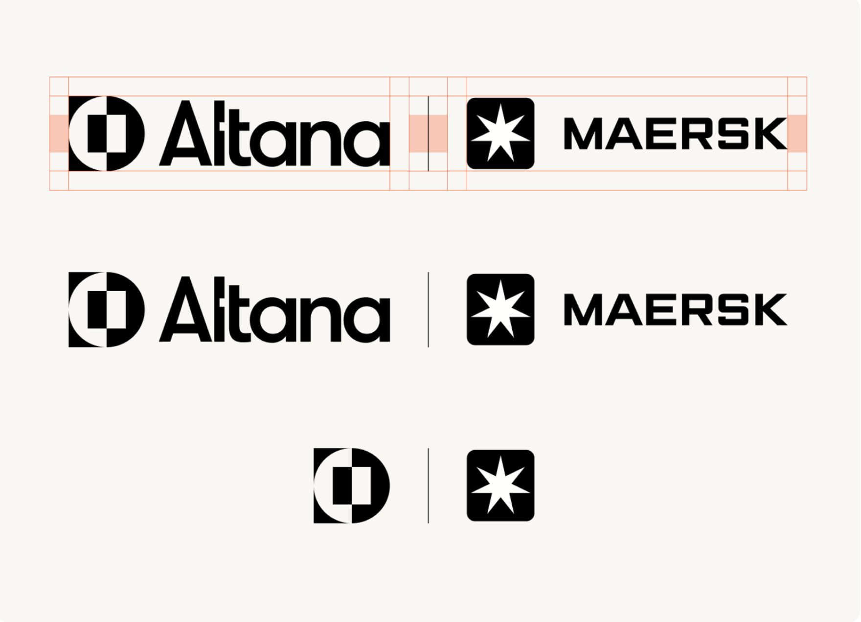
When pairing Altana’s logo with a partner logo, always use the primary Altana mark in black or white. Whenever possible, display the partner logo in matching monochrome for visual consistency.
Maintain the clear space rules outlined previously and use a vertical rule to separate the two marks. Avoid using only the symbols when possible.
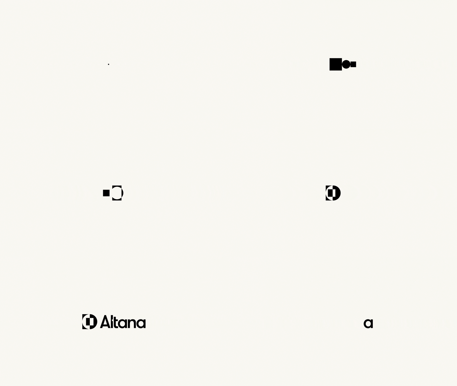
Use the animated bumper for video intros, social posts, and presentation openers. Let the logo resolve fully on screen before transitioning to other content.
02 — Color
Built around Mustard, our hero color, and supported by versatile neutrals. Mustard signals trust and clarity; neutrals provide warmth and breathing room. Use the secondary palette strategically to enhance impact.
For added vibrancy and flexibility. Use strategically to enhance impact.
Tints extend the core palette by blending each brand color with Light Horchata. The number indicates the percentage of the original color.
03 — Typography
Plain is our primary typeface—a modern sans-serif drawing on Swiss tradition, built for clarity at any size. Space Mono adds technical character to callouts. Helvetica Neue is the fallback for Google Workspace.
Used in Google Docs, Google Slides, and any other context where Plain is not available.
04 — Imagery
Our visuals are simple, modern, and timeless. Together they communicate our brand principles and the strength that comes from trusted relationships.
Three categories cover most use cases.
Quick rules of thumb for selecting and editing photography.
When we illustrate, we show how things are made—much like our platform.
Six principles that guide how Altana moves—from product transitions to brand storytelling.
05 — Applications
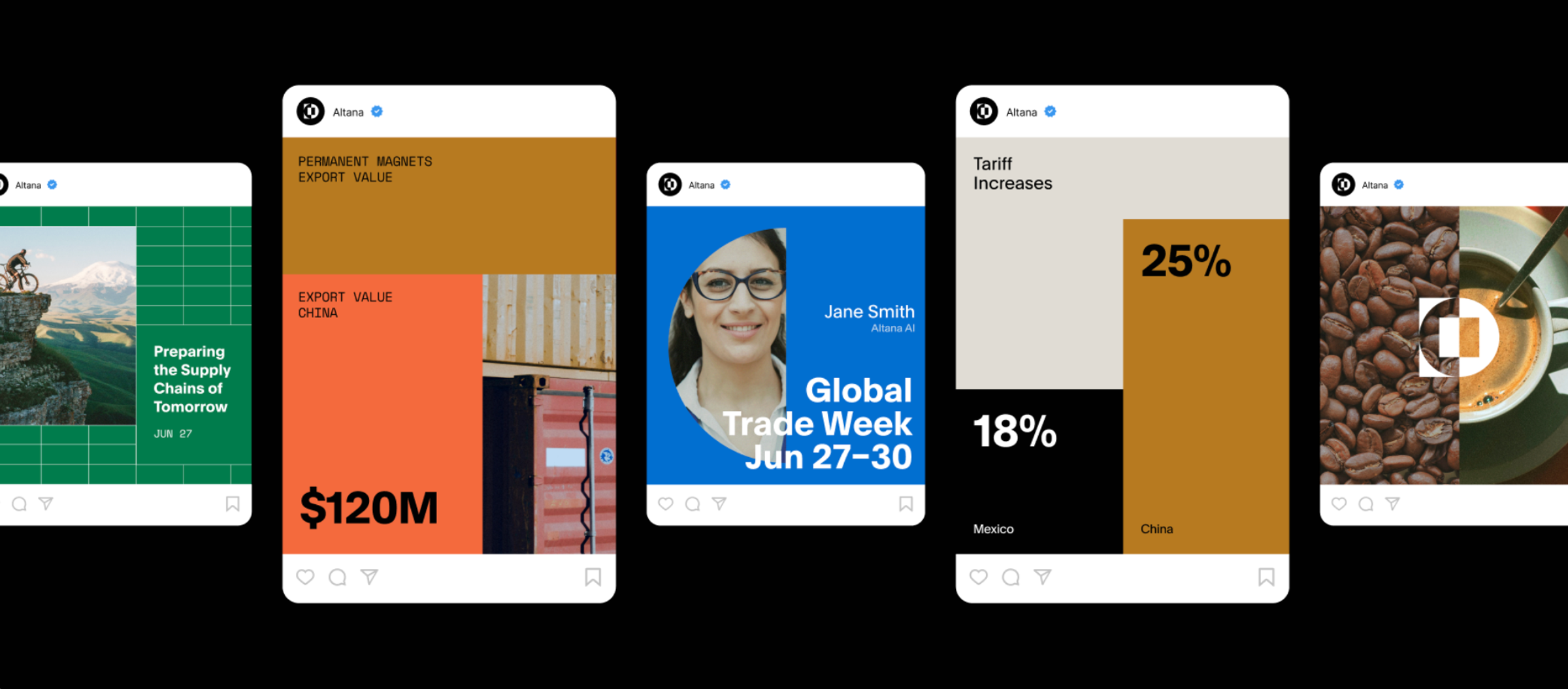
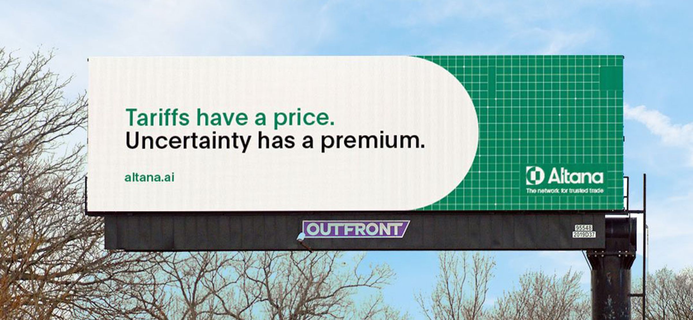
How our identity comes together across the channels we show up in—social, out-of-home, and sales. Each application uses the same building blocks: logo, palette, type, and imagery.
06 — Downloads
All our brand assets in one place. Reach out if anything is missing.
While these guidelines are comprehensive, some situations require interpretation. For brand or media questions, reach out below—we’re here to help you represent Altana well.